Wednesday, 26 December 2012

Government Police

Oppression an Revolution are the two main colliding themes in the Narrative for this concept. So the main most active force behind the oppressing role would be the Governments military police.
I wanted to draw this heavily from riot squads, however at the same time preserving the image that these people don't just get called out when things get ugly- I want them to look like they are always on the streets on duty and are the constant driving force behind directly and physically oppressing the City citizens-
In short, they couldn't look kitted out enough that wearing their uniforms for long periods of time per day would be tiresome.


In comparison to soft-looking armor, hard armor always feels more futuristic where it is applied. Researching  riot police from different countries had lots of different results. Some were more scantly armored than others. A common them in all of them however is that by wearing the same balaclavas and helmets, this makes them anonymous, it also inspires intimidation because their faces are covered.


In my concept I attempted to layer up the design of the character, from base overalls, then soft to hard and ballistic armor. A lot of riot police also use a color coded intimidation tactic by dressing everyone in black so that everyone looks the same, however when choosing the color pallet I wanted to keep hold of police colors such as blue and whites.


Continuing on from previous designs I incorporated the criss-cross pattern into the chestplate and sleeves. 
Though the intention to have a lot of fabric showing in two shades of police blue was intended to make the design look more light and maneuverable I feel that I put too much variation and pattern into it and the blue's are too friendly. It also looks very streamlined in places as opposed to the very bulky ballistic feel I wanted.
Next I hope to try colors that are darkened down and more washed out.

Wednesday, 19 December 2012

Female Gov Character Cont.

In the narrative concept I have based the location in an industrial city on the coast of the dried-up Okhotsk sea in 75-100 years time. I liked the idea of this location as it gives the concept a few cultural influences from Russia, Korea and Japan. The previous two concepts I had drawn from Korea and Japan, so I attempted concepting with a little Russian influence. 


The often high collars and broad shoulders of Russian jackets worked in my favor, but I immediately began to dislike the shape it was taking. 


Here I very specifically darkened down the green even further than before, and it gives a more serious impression than the lighter shades, higher boots in change of heels and thick-looking leggings were given to deal with colder temperatures.
I also made a point of making the bar code less obvious and made it appear to be removable.

Sunday, 9 December 2012

Female Gov Character

My first design for a Government citizen. With the nature of this government strongly suggesting totalitarianism it's important for theme's I've associated with this Government to drive the design; They feel almost militaristic, and preserve a strong sense of business about them while still being regarded only as citizens.


Referring back to my core narrative concept, the words I'd used to describe them were 'Overbearing' 'Ballistic'  'Green' 'Clean'

In the basic line drawing it was important to give the Gov citizens strong upright stances. The idea behind High collars and extended shoulders was to give even a female character a slightly more broad and upright appearance.
Here I played more with public identification, how these people would be singled out as being in league with this government; Using green to give them an opposing color to the city citizens, and the stripe down the dress that was influenced by bar codes.


The design felt a little too 'Dolly' and looked as though it needed more bulk. After studying characters and games with designs that seemed to have repeating patterns, I looked into making a pattern of my own, one that I wanted to persist throughout each design and include in a variety of ways. This pattern I am hoping to inspire a logo design for the Government and in turn something strong to identify them by. 


Here the female character looks bigger and more powerful, and the green has been darkened down. I also wanted more of a business edge to shine through.
I also wanted to run with the idea that in the Narrative there are camera's placed high above the streets that would bear down on and watch the city citizens as part of the totalitarian theme.
These camera's could also scan bar codes on clothes. Each bar code could be unique to the person wearing it and offer full insight to whom the person is for the person watching behind the camera.

Wednesday, 5 December 2012

Game Study

Last time I was talking about how we associate colors and shapes to identify factions of people or organisations. I decided to look into this further by studying the main factions in Halo 4. The reason for this is that in the previous Halo games, developers had already created two extremely opposing groups that had been designed well to appear as polar opposites from each other in almost every way; Humans and the Covenant
However in this game they had the challenge of integrating a third faction which would be the focus as the main enemies this time, instead of the Covenant.


Beginning with Master Chief and the logo, as the human side is the faction you assume control of the character in, the focus is military- You are at war. Green is a common color used in the military nowadays, however this color is given to the Master Chief alone in order to clearly set him apart from any other military-based character you may be fighting alongside.
Looking at the human faction as whole, the color code is blue, which has been introduced into the main characters design as blue lights that glow on particular parts of his armor.
All posters and the logo exampling the main character or the human faction always have blue as the dominating color.

As the game is in a futuristic setting where the advancement of technology is a strong theme, Blue applies to almost everything technological from such as computer panels, the players' HUD, weapon displays and even main characters.

In terms of form and shape, the human side for the most part takes a very primitive turn. Designs from architecture to ships and the main character himself have adapted bulky, blocky shapes.  I believe the intention of using bulk and rectangular shapes to display primitive-looking designs is to show the Humans at a certain stage of evolution, to visually stage them at a disadvantage to their opponents.


In every game before Halo 4, the Covenant have been the main antagonist, showing to be very alien as species and shows large variaty in opponents. As there are over 5 different alien races within this covenant, it is evident the developers thought it important to visually unify such different-looking aliens. As a result, all the armor the aliens wear have the same high-gloss, shiny texture, in turn which reflects back on their environment and ships. In surprising contrast, the covenant often sport brighter colors in their designs unlike the largely grey and blue color palette used by Humans.


Most colors used by the covenant range between iridescent purples and greens, which give's their equipment and vehicles an alien feel. Everything used by the covenant is smooth, and looks streamlined, right down to their armor. And most ships and weapons have a bulbous physical shape in comparison to the Human's very blocky ships and equipment.


The Forerunner are the main antagonists of Halo 4. Visually there are some similarities between the forerunner and two other factions, however this is because within the narrative of the game the forerunner pre-date both humans and the covenant by billions of years. 
The color palette is one of the main design links between human and forerunner, as all forerunner weapons, ships and technology sport grey metal tones, as well as using both blue and orange as their defining colors.
Commonly re-occurring shapes in their factions designs has been triangular, and demonstrates this through an entirely new level of alien to the player more-so than the covenant as most shapes of weapons and architecture are erratic and unpredictable.

The three main factions in the halo universe lend well to each other in other to define their own personal traits and set design rules while not stepping on the feet of the other. Each faction is vastly different and more unpredictably alien than the next.


Monday, 3 December 2012

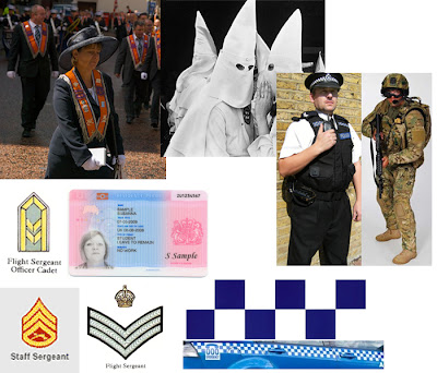
Identification

As my research brings me into characters that fall into specific factions I have found that an important, almost defining aspect of this is the ability to identify the way in which a character visually presents itself in order to identify it.
Identification in videogames falls among the most important aspects of defining not only visuals but gameplay also, specifically in multiplayer-focused games, such as the player needing to identify the opposition quickly and easily.

In this case, I am focusing on visuals, and how might the story and setting define how characters are set apart from one another, as characters must visually reflect what it is they represent as a culture or world of people.

As an example, it is entirely possible to visually identify our human race (In comparison to any other race of species out there in the universe ;) ) by how we typically wear clothes as a two piece, how our architecture is generally taller than our heads, how our form of travel is carried out on flat paths that stretch for miles.

The question I've then spawned from this is 'Well how else would you do it?' Though my focus isn't designing something alien, what I do want to do is think outside the box with design and in what ways we identify characters.

Good examples of opposing or differentiating factions of characters will contain good uses of shape, pattern and colour coding, this accounts for both day-to-day examples and ones in games and movies.


These are examples of identification for cultures, clans and authority that we have today.
I felt it was important to list literal identification also, like the passport or drivers licence as this is a direct window to a person/character, less visually but it will certainly inform their age group and country of origin, which the mind will stereo-typically draw up a mental image for alone.
Every one of these examples has a form of symbolism behind shapes and colors that are used in their design and that we now will commonly associate with that particular thing.


There is a heavy amount of narrative that lies behind shapes and colors used to identify factions in games and TV. Some are for aesthetics, and others tie directly into function. As games have become heavily multiplayer-based nowadays, we now typically associate the colors Red and Blue with multiplayer;
 If you are red, the blue's are the enemy, and if you are blue, the red's are the enemy.
In Star Trek, the ranking and department of a starship officer can be identified through their uniform. Yellow for Engineering/Tactical, Blue for Science and Red for Command. 
The rule of shape is also a heavily defining visual when identifying between oppositions. Circular shapes being friendly and more approachable are commonly associated with good, while pointed, triangular shapes are associated with the opposition and evil.
The games Gears of War and Tribes Ascend both heavily use this rule in character design, though sometimes not obvious, it is enough for the player to distinguish between the two opposing factions.

Friday, 30 November 2012

Fleshing out narrative

So moving on from the last post, i've tried to establish an image in my head of what kind of world these people live in, and the kind of design rules the characters will need to adhere to. This is a list i'm always adding to as I research more into what I want  these people to look like, but always keeping in mind the environment, colour and theme I have laid out.

Keeping to displaying how effective and engaging the use of visual contrast is, I've chosen to design the same character as both the factions occupying this industrial city.

The main theme behind my concept centers around oppression from both the opress-ee and the oppressors perspective.
The city (which I really need to name..) and it's way of life is under attack from foreign ideals being forced upon them. Oppression and revolution; both of these need to translate in the design.


To flesh out the concept more, (insert name here) is incredibly industrial, dangerously polluted city that sits on the coast of what remains of the Okhotsk seabed, one of the largest remaining sources of fossil fuels on the planet which due to their scarceness, are sold at a high price for those who need them. With the city being entirely self-maintained and self-funded, the main sources of work are hard labor or hands-on jobs such as mining, mechanics and plumbing. Clinging to the remnants of the industrial revolution the city is being forced into a new age of clean efficient energy by a heavily implied totalitarian government, an act that will change the lifestyle of the city that the people have become so accustomed to and embraced.

Creating a face for both the side of the government and the side for the people I felt were important as to identify themselves and identify their intentions as a body of people is an important aspect of design that spawns from narrative.


Monday, 19 November 2012

Constructing and visualizing concepts

So for a while the thought process ended up going off in a tangent and then grinding to a halt.
I started to think into a broader scope on character design, what makes characters how they look, what is it that sets design rules in place.
I began ask questions like, what was stopping the Master Chief being  5ft 7 instead of being 7ft 7? Why can't Link be right-handed instead of left?  Why do wolverines claws come from his knuckles, why not his fingers?
From here I recognized that the most interesting fictional characters live in rich, in-depth worlds with massive scope. These worlds have their own governments, their own military, their own pharmaceutical companies, even their own household brands. And these worlds have rules which designs need to consider and follow.

So my issue was how can we create and interesting character visually if we know nothing about them and the world they live in?


In a genre I found interesting enough to explore I wrote up a concept comprised specifically with adjectives, describing words that would bring back broader and more interesting results when used in visual research rather than searching for specific things for inspiration.
In a previous post I talked about cause and effect in design, so drawing from the idea I've used opposing adjectives to add depth and visual contrast.


Here i've branched off into themes I would like to look at, where when combining them with adjectives in my central concept come back with some interesting results. As well as other results, a particularly good example that came back was 'Aggressive Architecture'.


Congested Architecture


Aggressive Architecture


So from the perspective of the city (insert name here..) citizens, this seemingly green and positive government and it's ideals are unwanted ones. The city and it's people feel incredibly oppressed by this overbearing force of law.
I wanted this government to portray themselves as the height of civilization and appear to consider themselves above the people.
So with the words 'above' and 'overbearing' I thought about how I could show this quite literaly.


I liked the idea that as this Government has gradually occupied the 'industrial city' over the  years that  government-related places and buildings are literally built above street level and above the citizens. This could be for a number of reasons-
As pollution settles from the citys heavilly-industrial factories and power plants, the safest level of clean-breathable air reside mid high, below where pollution rises into the air, and above the common dirty and often dangerous street level. This provides a safer haven for Government citizens and officials.

Another reason is that with government buildings out of reach from the street level, it has become easier to monitor people below them via camera. All in all this re-enforces their image that they are literally and metaphorically 'Above the People'.  

Environments aren't really my thing but I mentioned before that by this point I had gone off in a big tangent.
So I drew up two outdoor-ish alleyways in the city, one that would solely occupied by city citizens and the other in the vicinity of a government building.


Typically, both corridors will show vast contrast that best represent either side, however the point I wanted to specifically draw attention to were the roofs. Continuing on the idea that government buildings are primarily above the streets and monitoring activity down below (via whichever media, lets say cameras for now) all ground level government architecture will sport glass or open roofs, while on the other had, city citizens try keeping the watchful government eye out by blocking out the roofs with sheets of plastic, planks of wood, general scrap, and leave warning signs depicting eyes and arrows pointing upward for others to be wary of. 


So yes, rather large tangent and a half. But on the other hand, by looking into designing a world for these characters I am going to concept I have created design rules that the characters need to follow.
So next step.

Saturday, 29 September 2012

Genre + Cause and Effect

After talking to Lynn I've been thinking more about what I could do for my project. I'm very interested in working with cliche genres when drawing and trying to create something new and original from them by crossing over genres, or taking something traditional and adding an unconventional twist to it.

I'm a big fan of incorporating 'cause and effect' into my work, for example, say we have a standard design for a futuristic sci-fi soldier, but the twist is that all banned drugs in the world are (for some reason or another) legalized.

How does the soldiers design change and adapt if he is a junkie and addict, or in comparison, if he decides he goes against the flow and is completely clean compared to everyone else?

I'd like for my projects practical work to incorporate crossings of genre's and this cause and effect theme to hopefully come up with interesting and new concepts for characters.


So here is a quick concept I drew up for a female car mechanic. She is set in the future, but not too far forward, and is aged between 25-35. 
She isn't a bright and bubbly character and has a bit of a problem with drinking on the job. 
A member of her family is abducted for whatever reason and she has to knuckle down, kick the habit and go rescue them.
She wears a thick, heavy jacket in the workshop that protects her from sparks, accidents with machinery or harmful substances hitting her skin. Maybe it could protect her from things more direct like weapons.

She also has a small computer built into her sleeve, it helps her in the workshop to do things such as navigate her way around car engines, or place orders for equipment or new parts for cars.
Maybe it could somehow help her rescue her abducted family member. 


This is a concept that I've been toying with to see how it would work together, what would a post apocalyptic Assassins Creed look like? Here I thought up the idea of someone scavenging the ruins of an assassins temple or burial sometime after the apocalypse and finds assassin garments that haven't survived well through the years, and so they have been crudely stitched together with a jacket of a similar size and shape. With this they also found a modern hidden blade gauntlet- but the blade itself was rusted and stuck, so they replaced it with the serrated edge of a broken knife. There were also damaged pieces of armor there that they patched together with an elbow pad.


This was my second concept for the same theme. I wanted to give focus on the Eagle in Assassins Creed, and perhaps in the post apocalyptic world, information and letters were sent over long distances by birds.
The character follows this theme with the bird of prey glove and scavenged eye equipment to enhance sight  over long distances. Still playing with this concept. 


Thursday, 27 September 2012

Narrative driving points

After class and a meeting with Lynn today I've started asking myself more questions in terms of the production process behind design.
It seems that examples of narrative influencing design in some cases show through less strongly than others and appears to happen more commonly in games than in movies.
In cases where it is the other way around, I've realized it's a common re occurance that where games that have weak story and narrative, will contain scantly clad females and butch men. This often becomes more of a selling point than the games' story and in terms of design, aesthetics vs functionality in characters are always clashing.


So looking at games and movies where narrative is the driving point behind the visual style and design I was looking for strong examples where this doesn't happen, or if it does, reaches a happy medium.


So In Equilibrium, all emotion and art forms have been outlawed. How did this effect the design of their world?
-Simple, functional attire for everyone.
-All clothing is color coded black or white.
-Architecture in the main cities are clean cut, no fancy brickwork or pretty windows.
-No bright colours, everything dons a pale, washed out color.
- Interior design is simple and functional and all furniture is one colour.


Mirrors edge follows a similar theme, where a city is ruled under a Totalitarian political system and the government controls all aspects of public and private life.
-Environments are clean cut
-No appearance of common city litter or graffiti, everything is 'Clean'
-As well as being a gameplay aspect, color coordinated rooms, paths and environments are also evidence of stating functionality.


Fallout is an obvious one, where the feuds of World War II didn't end, and 100 years later the world is stuck in a 50's envision of the future before the nuclear apocalypse takes over.
-Every design aspect of the game shows sign of weathering and age
-All attire is roughly put together using scavenged materials
-Some weapons recycled from everyday equipment, lawn mowers, batteries, vacuum cleaners etc.
-Clear signs of futuristic advancement before the apocalypse

Monday, 24 September 2012

First Thoughts

First Thoughts 


So first post for my honours project- Lets get the ball rolling.

So I want my project to explore character design and concept, watching a character evolve from that first awful doodle on the back of a notebook to something that will appear in a game or an animation. 

I think my focus will be what happens in between those points when you look at a concept and think
'Why is he interesting? Whats his story?'

In short, the process in which narrative effects the concept for a character, vice versa, and the extent of this effect.
I'm hoping that this idea will develop over time, and that a good research question will come of it.


Property of Wesley Burt - Massive Black

As a rough outline, within the next few weeks or so I will be:

-Researching concept artists
-Exploring characterization
-Looking at the design of game worlds, where a character fits
-Cultures, fashion styles
-Aesthetic vs Function  
-Developing art skills, looking at tutorials, how the pro's do it. 
-Drawing up concepts for characters

Thats all for now folks :) x