Friday 15 March 2013

As I had missed out on semester 2 of pitch, It was challenging to condense everything from that semester for crit and organize all the research and work I had accumulated.

The biggest progressions that I focused on presenting weer the development of a base concept, going into detail as to how I came to create the concept itself, the changes i'd made to it along the way and explaining how the core concept would be the driving point behind my designs

I then showed and explained the character concepts, not in as much detail as i'd hoped as I forgot to mention a few important design points in the presentation. Overall I was met with optimism and a lot of suggestions in where to take my research next.


Feedback summary.
Robin, Ryan, Brian:


Look at real world examples of world oppression 

My oppressive government:
How do they treat people 
What do they make them wear
How does the media deal with it

Expand an oppressive regime. 
“HG Wells Time Machine” Future society that provides everything.

Appendages for government class, how is it different from mining class?
-Identification + Affiliation (Focus on?)

Produce a range of characters for final (Flagged Twice)
-Where is the final design coming from?

More experimentation and iteration 


Look at - 
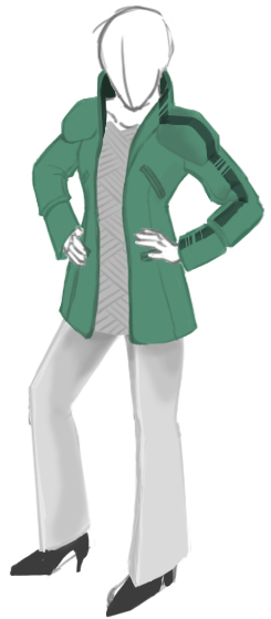
Logans Run. Film Study
Fashion, Vogue. 5th Element Fashion, Case Study?
Mass Effect fashion iteration. Talk about iteration and compare with games that do the same.
How Fashion is portrayed in games
Designing characters for ‘Urban Living’
1984 J 


I found that fashion design was an interesting and unexpected research topic to bring up and I will explore it into specifics and in what ways it can conjoin with concept design.
Another of the next major research points will be fleshing out the bones of the concept further, I feel the story and the background of the City and Government people would require a more focused, personal take on the design of a character rather than mass-designing a general style. 

Tuesday 5 February 2013

City Citizens

The city citizens were the ones i've worried the most about designing. To properly envision them would mean taking the main setting of this concept, which is the large, polluted industrial city itself into account.

In the beginning I found it impossible to properly design a character without knowing the context of it's environment, so I did some sketches of what I felt the environment for both the government and city would look like.
But something was missing, and it was something I've touched lightly on in my previous concepts without even realizing. Culture.
To continue designing the city and it's people as I have been doing is to follow typical cliche and stereotype, which for the basis of this project is what I've tried to avoid.
As my project resides around designing characters for game worlds, the World is something i feel i need to focus on more.


Sometime before I had chosen a location for the concept, which was the sea of Okhotsk, which sometime in the future has dried up around it's shores. 

Reasons for this location where-
unconventional location
Out of the way from western civilization
 Relatively isolated, Civil conflict overlooked/unknown

But most importantly, the two countries Okhotsk sea lays on the borders of; Japan and Russia. 

Culturally these countries are massively contrasting, and in my future concepts I want to visually draw more from their cultures, be it one or the other, or both.


The above concept was a brain storm of sorts. I thought of splitting the City citizens into two categories, living and working. Because the city powers itself with fossil fuel mined from the Okhotsk seabed, someone is going to have to mine it. The concept began as general living class with plain clothing and hood in order to remain anonymous, but because of my love for things mechanical, this particular person is an amputee from an injury while mining underground, which, despite it's clunky appearance, is actually stronger than his original leg and in some cases allows him to perform better.

Bleh


Wednesday 30 January 2013

Government Police Cont.

In this design I attempted to avoid using the continual cross design too much, as in the previous concept it made the character look too eastern and typically anime/manga. 
I traded 'sharp ballistic' for 'rounded ballistic' and in many aspects generally rounded of the edges of parts of the design, even though this works in opposite to the triangle evil and circle friendly design rule. 

Instead I incorporated straight edges into textures for the riot armor to compensate. This is probably the first time I've used textures in an illustration so i'm still working on how to make them look good. 


I felt it important to identify fabric and material textiles, as they can be associated with certain types of clothing. For militaristic clothing, Kevlar, plastics and webbing are materials most commonly used. 
Felt my drawing skills have improved as I go but my drawing perspective could do with improving. 

Though I've washed the blues out like I mentioned before, typical colors that are commonly associated with riot gear and police aren't working together either, I could do with looking into color theory to improve on this. Though I think aesthetically this concept is an improvement on the last. 


Wednesday 26 December 2012

Government Police

Oppression an Revolution are the two main colliding themes in the Narrative for this concept. So the main most active force behind the oppressing role would be the Governments military police.
I wanted to draw this heavily from riot squads, however at the same time preserving the image that these people don't just get called out when things get ugly- I want them to look like they are always on the streets on duty and are the constant driving force behind directly and physically oppressing the City citizens-
In short, they couldn't look kitted out enough that wearing their uniforms for long periods of time per day would be tiresome.


In comparison to soft-looking armor, hard armor always feels more futuristic where it is applied. Researching  riot police from different countries had lots of different results. Some were more scantly armored than others. A common them in all of them however is that by wearing the same balaclavas and helmets, this makes them anonymous, it also inspires intimidation because their faces are covered.


In my concept I attempted to layer up the design of the character, from base overalls, then soft to hard and ballistic armor. A lot of riot police also use a color coded intimidation tactic by dressing everyone in black so that everyone looks the same, however when choosing the color pallet I wanted to keep hold of police colors such as blue and whites.


Continuing on from previous designs I incorporated the criss-cross pattern into the chestplate and sleeves. 
Though the intention to have a lot of fabric showing in two shades of police blue was intended to make the design look more light and maneuverable I feel that I put too much variation and pattern into it and the blue's are too friendly. It also looks very streamlined in places as opposed to the very bulky ballistic feel I wanted.
Next I hope to try colors that are darkened down and more washed out.

Wednesday 19 December 2012

Female Gov Character Cont.

In the narrative concept I have based the location in an industrial city on the coast of the dried-up Okhotsk sea in 75-100 years time. I liked the idea of this location as it gives the concept a few cultural influences from Russia, Korea and Japan. The previous two concepts I had drawn from Korea and Japan, so I attempted concepting with a little Russian influence. 


The often high collars and broad shoulders of Russian jackets worked in my favor, but I immediately began to dislike the shape it was taking. 


Here I very specifically darkened down the green even further than before, and it gives a more serious impression than the lighter shades, higher boots in change of heels and thick-looking leggings were given to deal with colder temperatures.
I also made a point of making the bar code less obvious and made it appear to be removable.

Sunday 9 December 2012

Female Gov Character

My first design for a Government citizen. With the nature of this government strongly suggesting totalitarianism it's important for theme's I've associated with this Government to drive the design; They feel almost militaristic, and preserve a strong sense of business about them while still being regarded only as citizens.


Referring back to my core narrative concept, the words I'd used to describe them were 'Overbearing' 'Ballistic'  'Green' 'Clean'

In the basic line drawing it was important to give the Gov citizens strong upright stances. The idea behind High collars and extended shoulders was to give even a female character a slightly more broad and upright appearance.
Here I played more with public identification, how these people would be singled out as being in league with this government; Using green to give them an opposing color to the city citizens, and the stripe down the dress that was influenced by bar codes.


The design felt a little too 'Dolly' and looked as though it needed more bulk. After studying characters and games with designs that seemed to have repeating patterns, I looked into making a pattern of my own, one that I wanted to persist throughout each design and include in a variety of ways. This pattern I am hoping to inspire a logo design for the Government and in turn something strong to identify them by. 


Here the female character looks bigger and more powerful, and the green has been darkened down. I also wanted more of a business edge to shine through.
I also wanted to run with the idea that in the Narrative there are camera's placed high above the streets that would bear down on and watch the city citizens as part of the totalitarian theme.
These camera's could also scan bar codes on clothes. Each bar code could be unique to the person wearing it and offer full insight to whom the person is for the person watching behind the camera.

Wednesday 5 December 2012

Game Study

Last time I was talking about how we associate colors and shapes to identify factions of people or organisations. I decided to look into this further by studying the main factions in Halo 4. The reason for this is that in the previous Halo games, developers had already created two extremely opposing groups that had been designed well to appear as polar opposites from each other in almost every way; Humans and the Covenant
However in this game they had the challenge of integrating a third faction which would be the focus as the main enemies this time, instead of the Covenant.


Beginning with Master Chief and the logo, as the human side is the faction you assume control of the character in, the focus is military- You are at war. Green is a common color used in the military nowadays, however this color is given to the Master Chief alone in order to clearly set him apart from any other military-based character you may be fighting alongside.
Looking at the human faction as whole, the color code is blue, which has been introduced into the main characters design as blue lights that glow on particular parts of his armor.
All posters and the logo exampling the main character or the human faction always have blue as the dominating color.

As the game is in a futuristic setting where the advancement of technology is a strong theme, Blue applies to almost everything technological from such as computer panels, the players' HUD, weapon displays and even main characters.

In terms of form and shape, the human side for the most part takes a very primitive turn. Designs from architecture to ships and the main character himself have adapted bulky, blocky shapes.  I believe the intention of using bulk and rectangular shapes to display primitive-looking designs is to show the Humans at a certain stage of evolution, to visually stage them at a disadvantage to their opponents.


In every game before Halo 4, the Covenant have been the main antagonist, showing to be very alien as species and shows large variaty in opponents. As there are over 5 different alien races within this covenant, it is evident the developers thought it important to visually unify such different-looking aliens. As a result, all the armor the aliens wear have the same high-gloss, shiny texture, in turn which reflects back on their environment and ships. In surprising contrast, the covenant often sport brighter colors in their designs unlike the largely grey and blue color palette used by Humans.


Most colors used by the covenant range between iridescent purples and greens, which give's their equipment and vehicles an alien feel. Everything used by the covenant is smooth, and looks streamlined, right down to their armor. And most ships and weapons have a bulbous physical shape in comparison to the Human's very blocky ships and equipment.


The Forerunner are the main antagonists of Halo 4. Visually there are some similarities between the forerunner and two other factions, however this is because within the narrative of the game the forerunner pre-date both humans and the covenant by billions of years. 
The color palette is one of the main design links between human and forerunner, as all forerunner weapons, ships and technology sport grey metal tones, as well as using both blue and orange as their defining colors.
Commonly re-occurring shapes in their factions designs has been triangular, and demonstrates this through an entirely new level of alien to the player more-so than the covenant as most shapes of weapons and architecture are erratic and unpredictable.

The three main factions in the halo universe lend well to each other in other to define their own personal traits and set design rules while not stepping on the feet of the other. Each faction is vastly different and more unpredictably alien than the next.